Data Visualization
Create AI-powered, interactive dashboards that turn complex data into clear, compelling insights. Explore, collaborate, and act on your data in real-time.
Start for Free
Visualize Data. Make Decisions Faster.
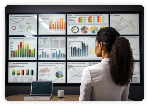
Our brains process visuals 60,000 times faster than text.
That’s why dashboards work. They turn raw data into instantly understandable stories. Visual elements like charts, graphs, and maps, when combined with advanced analytics and interactive dashboards help everyone, from analysts to execs, understand what’s happening and why.
What-If Analysis
Geo-fencing & Choropleth in Map
Layering and Clustering in maps
Visual Lines


Benefits of Data Visualization
Faster decision-making
Visual and interactive formats speed up understanding and encourage real-time decision making.
Time-saving insights
AI-powered dashboards highlight what's most important, so you don’t waste time sifting through data.
Stronger retention
Visual data is easier to remember. Your team is more likely to recall and act on what they see.
Collaborative storytelling
Visualization offers insights that everyone can understand. This builds alignment, helping teams make confident, shared decisions.
Built-in context
Combine charts with KPIs and narrative widgets to show the “what,” “why,” and “how” behind your data.

Choose the Right Visualization for Your Data
Data visualizations come in many shapes and sizes, to highlight different aspects of your data. Choose the visual that matches your data and the story you want to tell:

Line Charts
Perfect for tracking changes over time. Explore how much your revenue has grown this quarter or how visitor numbers fluctuate.
Pie and Donut Charts
These are great for showing proportions. How much of your budget is spent on marketing?


Heat Maps
Use color intensities to understand complex data patterns quickly. Which areas of your store see the most foot traffic? Where do users click most on your site?
Scatter Charts
Scatter plots are excellent for identifying correlations between variables. Is there a link between customer satisfaction scores and repeat sales?


Funnel and Pyramid Charts
Visualize stages in a process, like sales funnels or project stages, to identify potential drop-offs or improvements.
Custom Layouts and Widgets
Tailor your dashboards with widgets that provide specific functionality or custom layouts that fit your unique data storytelling needs.

Common Challenges in Data Visualization
Choosing the wrong chart
Most users often choose the most familiar chart, not the most effective one. Lumenore matches your data with the most suitable visualizations to convey the story effectively.
Poor layout and labeling
Cluttered dashboards don’t inspire action. They confuse people. Lumenore prioritizes clean design, intentional spacing, and clear labeling, so the story comes through clearly.
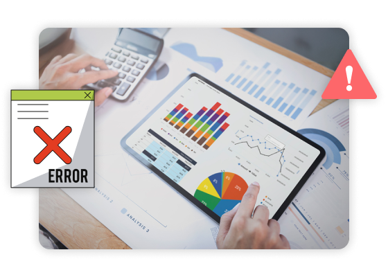
Manual Errors
If you’re still manually updating data reports, there’s a better way. Lumenore connects to your live data, so your visualizations stay up-to-date and reliable.
Human Error
Minimize mistakes. Automate data processes to enhance accuracy and reduce the risk of errors.
Explore Tailored Analytics
Dive into a suite of flexible solutions that make your data journey simple, fast and seamless.
Start Exploring Visual Insights
Build interactive, AI-powered dashboards your teams can use, share, and explore – in minutes. No code, always up to date.

